DonateMate UX Research & Design
I've included this sample mobile app project to demonstrate my UX design approach.
My role
- User Research
- Usability Testing
- Wireframing
- Prototyping
Tools used
- Balsamiq
- Excel
- PowerPoint
User Research
I first looked at quantitative demographic data around charitable giving habits in Australia and various competing services (apps, websites etc) operating in the charitable giving space.
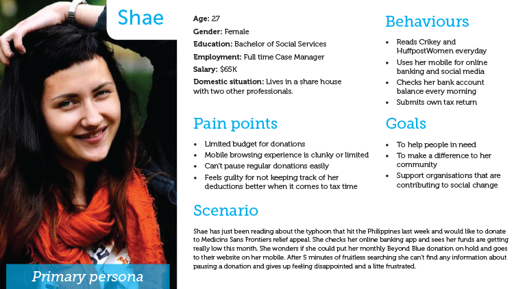
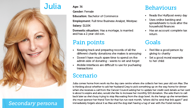
For more qualitative data I chose to conduct one on one interviews. Because Donate Mate was a brand new app there wasn't an existing pool of users to target so I created some screening questions for potential interview candidates and shared this with my network. I conducted one on one interviews with potential Donate Mate app users and documented my findings using Personas.
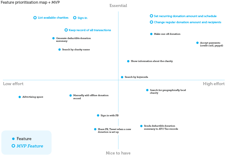
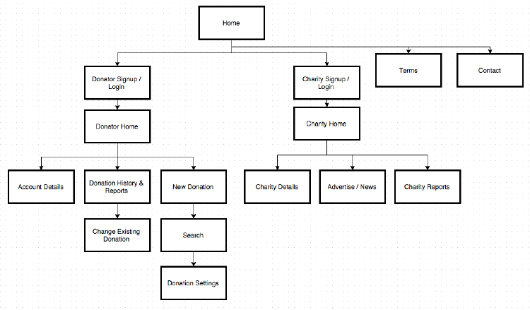
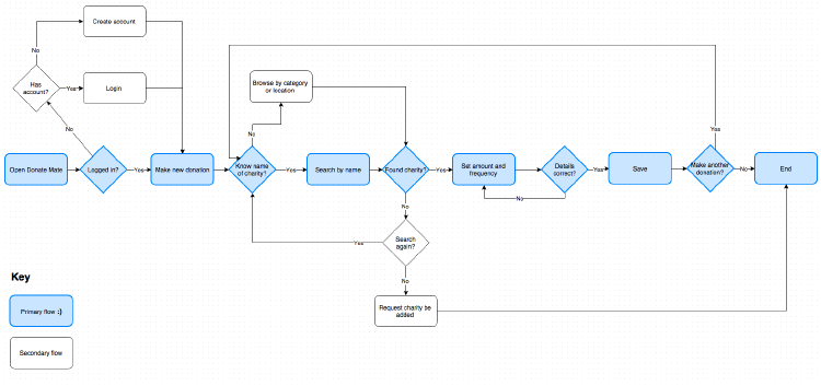
Content + Information Architecture
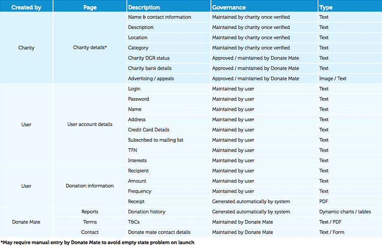
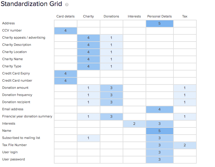
Based on my Personas I created a content strategy, sitemap and user flow. I used Optimal Sort to conduct a remote card sorting activity to better understand how my users would naturally group the apps content and where they'd expect to find certain functions. I also uncovered a potential empty state problem with the app that could be solved by some manual data entry until the user base grew.
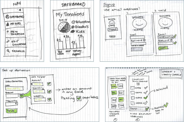
Sketches + Wireframes
I took up my trusty copic markers and started sketching different parts of the apps UI to help me visualise the content structure and user flow. I've recently discovered the "Crazy Eights" technique to help come up with a broad range of possible design solutions.
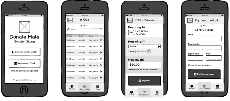
Prototypes + User Testing
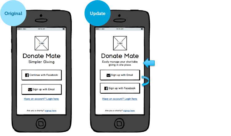
I conducted face to face user tests of a prototype of the app made in Balsamiq, to identify potential usability problems early. In testing a discovered a few important problems and was able to make some relatively minor adjustments to improve the apps usability.
Users wanted to be able to use different cards and paying via PayPal was seen as quicker than typing in card details.
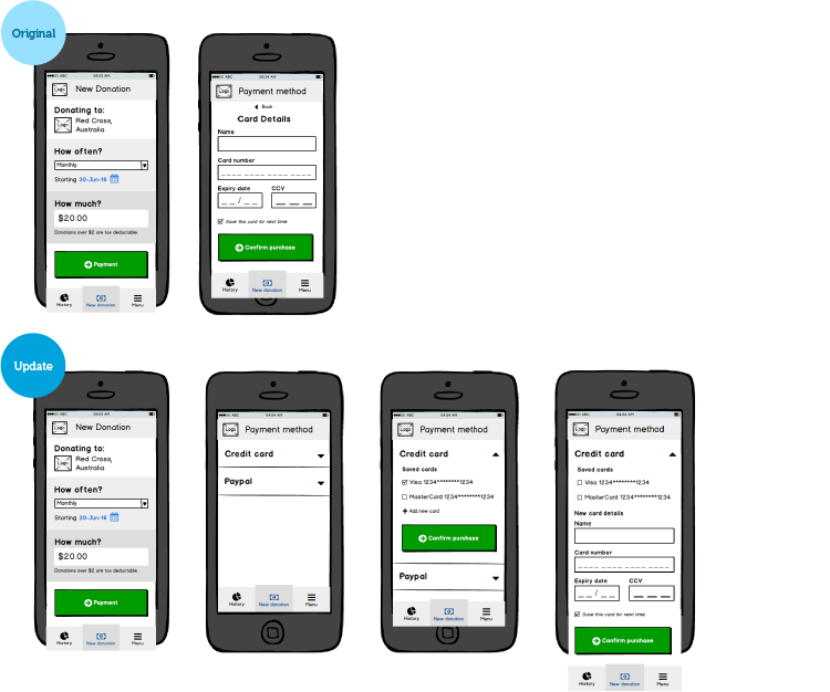
Users preferred using email to login and wanted a bit more detail about the app.